
Choosing brand colors isn't just about picking colors you personally love. Your color palette becomes part of how people recognize, remember, and experience your business.
The right colors can help communicate whether your brand feels bold, sophisticated, approachable, energetic, calming, luxurious, or playful—before someone reads a single word.
So, how do you choose brand colors for your business?
Start by thinking about your brand's personality, the audience you want to attract, and the feeling you want your business to create. From there, build a cohesive color palette that can be used consistently across your website, social media, marketing materials, and other brand touchpoints.
TL;DR: How to Choose Brand Colors
Your brand colors should reflect who your business is, who you want to attract, and how you want people to feel when they interact with your brand.
Instead of choosing colors based only on personal preference or current trends, consider:
Your brand personality
Your ideal audience
The emotions your colors communicate
How the colors work together
Whether the palette works across digital and print applications
Accessibility and readability
How consistently the colors can be used throughout your brand
A beautiful palette is important. A strategic, recognizable palette is even better.
Start With Your Brand Personality
Before opening a color picker, think about how you want your business to be perceived.
Is your brand:
Modern and sophisticated?
Warm and approachable?
Bold and energetic?
Soft and elegant?
Professional and trustworthy?
Two businesses offering similar services could use completely different colors because they're trying to create different experiences.
A luxury wedding photographer may want an elegant, editorial feel, while a family photographer may want their brand to feel warm, joyful, and approachable.
Your colors should reinforce that distinction.
Think About the People You Want to Attract
Your brand isn't created only for you. It's also communicating with your potential customers.
Consider what your ideal customer expects to experience when interacting with a business like yours.
This doesn't mean every business within an industry should use the same colors. In fact, thoughtful color choices can help differentiate your business in a crowded market.
The goal is finding the balance between connecting with your audience and creating a brand that's distinctly yours.
Understand the Feeling Behind Your Colors
Colors can create associations and influence how a brand feels.
Soft neutrals may create a sense of simplicity or refinement. Bright colors can feel energetic and playful. Darker tones can create a sophisticated or dramatic appearance. Natural, earthy colors often feel grounded and organic.
But color psychology isn't a rigid formula.
Blue doesn't automatically make a business trustworthy, and black doesn't automatically make a brand luxurious.
The combination of your colors, typography, imagery, messaging, and overall design creates the complete brand experience.
That's why colors should never be chosen in isolation.
Build a Palette, Not Just a Favorite Color
A strong brand identity usually needs more than one color.
Your primary brand color may be the most recognizable, but supporting colors help create flexibility throughout your website and marketing.
A thoughtful brand palette can include a primary color, secondary colors, neutrals, and accent colors that work together cohesively.
More importantly, there should be intention behind where and how those colors are used.
The color of a button on your website, for example, isn't only a design decision. It can also influence visibility, readability, and how easily visitors recognize where to take action.
Make Sure Your Colors Work in the Real World
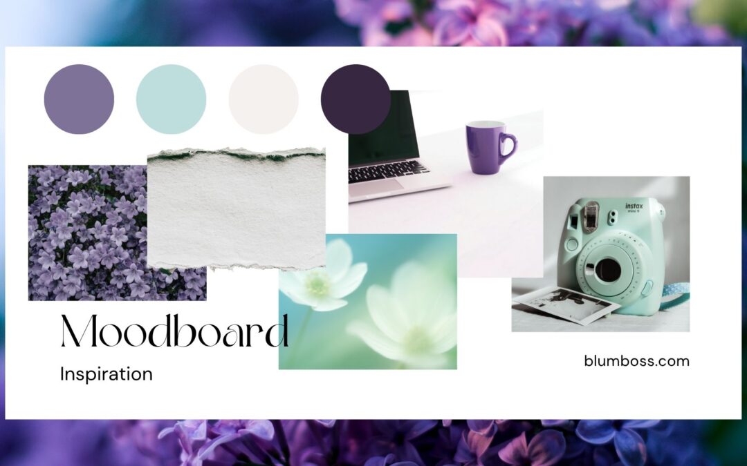
A palette can look beautiful on an inspiration board and still be difficult to use in an actual brand.
Your colors need to work across your:
Website • Logo • Social Media • Marketing Materials • Signage • Print Materials • Digital Graphics
Contrast and readability matter, too.
If visitors struggle to read text because there isn't enough contrast between your background and font colors, aesthetics are getting in the way of the user experience.
Professional branding considers both.
Consistency Creates Recognition
Once you've established your brand colors, consistency matters.
Repeated use of the same visual identity helps customers begin associating certain colors, typography, imagery, and design elements with your business.
Over time, those elements become part of how your brand is recognized.
This is why constantly changing colors based on trends can make it harder to build a cohesive identity.
Your brand can evolve, but it should still feel intentional.
Your Brand Colors Should Do More Than Look Good
Choosing brand colors can be fun, but good branding goes deeper than creating a beautiful color palette.
Your colors should support your positioning, communicate your personality, appeal to the right audience, and work cohesively throughout your entire brand.
Ultimately, the question isn't simply:
“What colors look good together?”
It's:
“What should people feel when they experience my brand?”
At BlūmBoss®, we approach branding with strategy behind the visuals—creating cohesive brand identities designed to help businesses look professional, communicate clearly, and become more recognizable.
Because your brand shouldn't just be beautiful.
It should feel like your business.
Ready to create a brand with intention behind every detail? Explore our Branding Services.