A successful logo redesign isn't simply about making an old logo look newer. It's about identifying what's working, what's creating friction, and what changes can make the brand easier to recognize, understand, and use.
For this home décor brand, the original logo had a modern, handwritten feel, but there was one major challenge:
The business name wasn't immediately easy to read.
Instead of starting over just for the sake of creating something different, we looked at how the logo could better communicate the business name and what the brand actually offers.
The result was a redesigned identity with stronger typography, clearer hierarchy, and visual details inspired by the home décor industry.
Here's exactly what we changed—and why.
TL;DR: The Logo Redesign
For this logo redesign, we focused on three primary goals:
- Make the business name easier to read and recognize
- Give the brand a stronger, more distinctive visual identity
- Incorporate elements that subtly communicate home décor
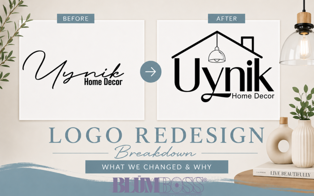
The original script-heavy logo was replaced with a larger, more legible business name. We also incorporated the shape of a home's roof and a hanging pendant light to connect the identity to the home décor industry.
The goal wasn't simply:
“How can we make this logo look different?”
It was:
“How can we make this logo work better for the business?”
The Before: A Stylish Logo With a Readability Challenge
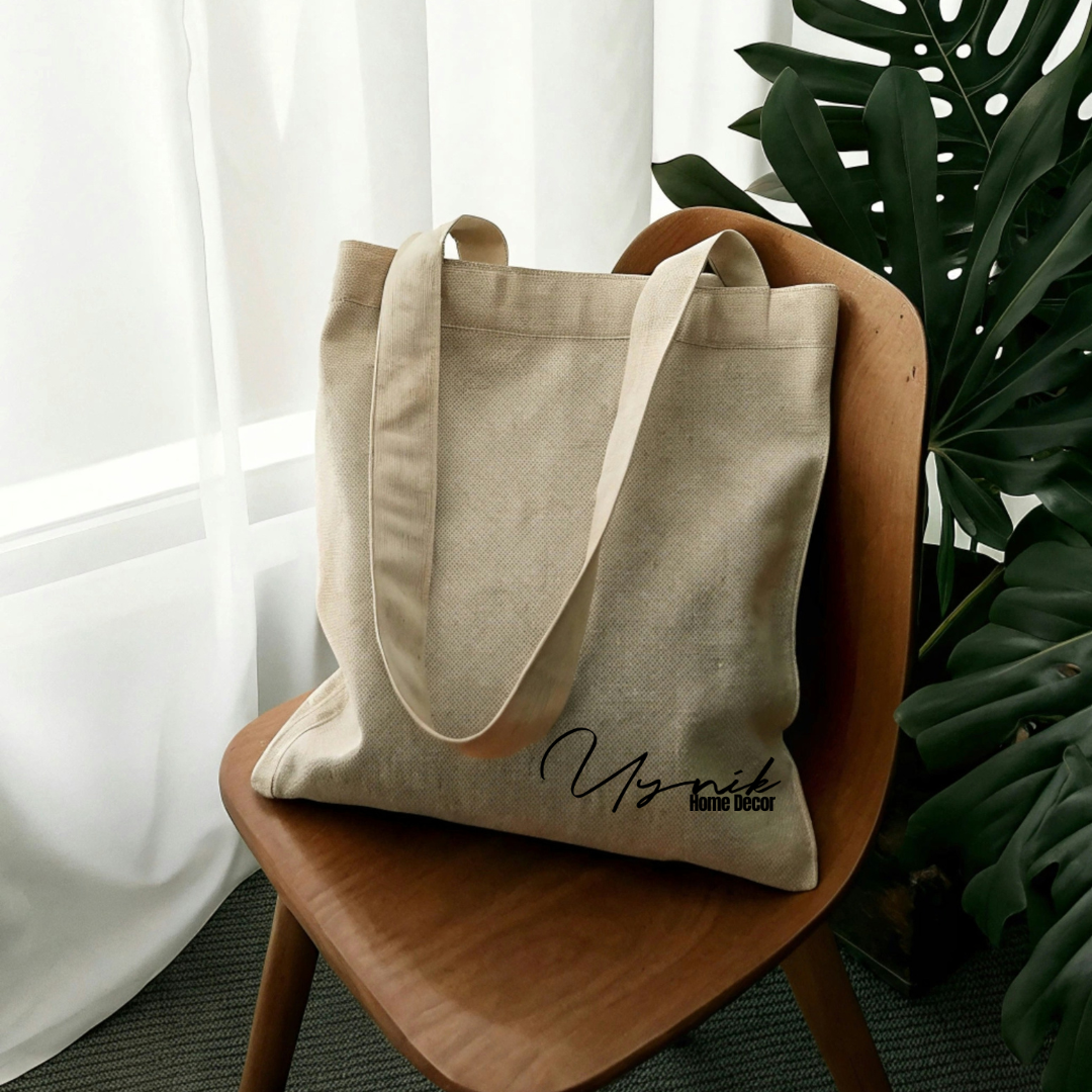
The original Uynik Home Decor logo relied heavily on handwritten script.
Script typography can give a brand personality, movement, elegance, or creativity, but there's an important consideration:
Can someone immediately read the business name?
In this case, the highly stylized lettering made “Uynik” more difficult to distinguish at first glance.
That becomes especially important when you consider where customers might encounter a logo:
Social media • Website headers • Business cards • Packaging • Signage • Marketing graphics • Product tags
A customer shouldn't have to study a logo to figure out the name of the business.
So readability became one of the biggest priorities of the redesign.
Change #1: We Made “Uynik” Easier to Read

One of the most noticeable changes is the typography.
Instead of presenting the entire business name in a handwritten script, the redesigned version gives Uynik significantly more visual weight.
The letters are larger, cleaner, and easier to distinguish.
We didn't remove personality completely. The sweeping detail beneath the “y” introduces movement and character without requiring the entire word to rely on script lettering.
That's an important distinction in logo design.
Personality shouldn't come at the expense of readability.
If a potential customer sees your logo for only a few seconds, you want the business name to be one of the first things they recognize.
Change #2: We Created a Stronger Visual Hierarchy
The original logo placed “Home Decor” directly beneath and partially within the visual space created by the script business name.
In the redesigned logo, there's a much clearer hierarchy:
Uynik is the brand.
Home Decor explains what the business offers.
The eye naturally notices the business name first and the descriptor second.
This makes the logo easier to process quickly.
Visual hierarchy matters because every element of a logo doesn't need to compete for the same amount of attention.
There should be a clear answer to:
What should someone notice first?
For this brand, that answer needed to be Uynik.
Change #3: We Added the Roofline
The most significant graphical addition was the roof surrounding the business name.
This gives the logo an immediate visual connection to home without requiring the design to include an overly detailed illustration of a house.
The roofline also serves another purpose: it helps contain the typography.
Instead of having a business name floating independently, the roof creates a visual structure around it and makes the entire logo feel more like one cohesive mark.
This is where a logo redesign can become more strategic.
We aren't adding graphics simply because there's empty space.
We're asking:
Does this element communicate something meaningful about the brand?
For Uynik Home Decor, the answer was yes.
Change #4: We Added the Hanging Light
The pendant light is one of the smaller details in the redesign, but it helps complete the concept.
The roof communicates home.
The hanging light communicates interior and décor.
Together, they create a visual reference to what someone might experience inside a thoughtfully designed home.
Rather than adding a generic home icon next to the business name, we incorporated these elements directly into the architecture of the logo.
The result gives the brand a more distinctive identity while keeping the business name at the center of the design.
Change #5: We Made “Home Decor” a Supporting Element
“Home Decor” is important because it immediately tells customers what type of business they're looking at.
But it doesn't need to overpower the actual brand name.
In the redesigned logo, Home Decor is presented in a simpler, lighter typeface and positioned as a supporting descriptor.
That creates contrast between the two pieces of information:
Uynik = Who we are
Home Decor = What we do
This makes the overall logo easier to understand at a glance.
Before vs. After: What Actually Improved?
When you compare the two versions, the biggest difference isn't simply that one has more design elements.
The redesign improves how the identity communicates.
Before
The original logo had:
- A heavily script-based business name
- Lower readability at first glance
- Limited visual indication of the industry
- Less distinction between the brand name and descriptor
After
The redesigned logo has:
- A larger, more recognizable business name
- Improved readability
- Clearer visual hierarchy
- A roofline representing home
- A pendant light connecting the identity to décor
- A clearer distinction between “Uynik” and “Home Decor”
- A more distinctive overall brand mark
Those are strategic changes—not simply aesthetic ones.
Does Every Logo Need to Show What the Business Does?
No.
And this is an important distinction.
A photographer doesn't automatically need a camera in their logo. A baker doesn't need a cupcake. A Realtor doesn't need a house.
Sometimes an entirely typographic or abstract identity is the stronger choice.
The question is whether an illustrative element adds meaning without sacrificing clarity.
For Uynik Home Decor, the roof and hanging light worked because they became integrated parts of the identity rather than separate decorative icons.
That's the difference between adding something because it “looks cute” and adding something because it strengthens the brand concept.
Why Logo Readability Matters
Your logo doesn't always appear large.
It may eventually need to work in a tiny Instagram profile image, at the top of a mobile website, on packaging, on printed materials, or alongside dozens of other businesses.
That means one of the questions we consider during a logo redesign is:
Will this still work outside of the design screen?
A highly detailed or difficult-to-read logo may look beautiful when displayed at full size but lose its effectiveness when used in real-world applications.
That's why good logo design balances:
Personality + Readability + Recognition + Versatility
The goal isn't to eliminate creativity.
It's to make creativity functional.
A Logo Doesn't Have to Be Broken to Be Improved
One of the biggest misconceptions about rebranding is that an existing logo has to be “bad” before it can be redesigned.
It doesn't.
Sometimes a business simply outgrows its original identity.
Other times, a logo reveals practical issues once the business begins using it across websites, social media, packaging, signage, and other marketing materials.
The better question isn't:
“Is my logo bad?”
Ask:
“Is my logo doing its job?”
Can people read it?
Can they recognize it?
Does it represent the business you've built?
Can you use it consistently?
Does it still fit where your brand is going?
If several of those answers are no, it may be worth considering a redesign.
Your Logo Is Part of a Bigger Brand Identity
A logo is important, but it's only one part of what makes a business recognizable.
Your complete visual identity can include:
Logo • Brand Colors • Typography • Photography • Graphic Elements • Website • Social Media • Packaging • Marketing Materials
Those elements should feel connected rather than designed independently.
[INTERNAL LINK: Link the following text to your “How to Choose Brand Colors for Your Business” article.]
Choosing the right brand colors for your business is another important part of creating a cohesive and recognizable visual identity.
When the logo, colors, typography, imagery, and website all support the same brand personality, the business begins to feel much more intentional.
The Strategy Behind the Design Matters
Looking at the before and after, it's easy to focus only on what changed visually.
But the more important story is why it changed.
We made the business name easier to read because recognition matters.
We strengthened the hierarchy because customers need to quickly distinguish the brand name from the descriptor.
We added the roof because it communicates home.
We added the pendant light because it connects the identity to décor.
And we kept the overall design focused on the business name because the logo still needs to function as an identifier first.
That's what strategic branding is about.
At BlūmBoss®, we don't approach a logo redesign by simply asking how we can make something prettier.
We look at what the brand needs to communicate, where the identity will be used, and how design can make the business clearer, more recognizable, and more cohesive.
Because your logo isn't just something you put on your business.
It's one of the ways people learn to recognize it.
Does Your Logo Still Represent the Business You're Building?
If your current logo is difficult to read, hard to use, or no longer reflects your business, a strategic redesign may be the next step.
Explore Our Branding Services →